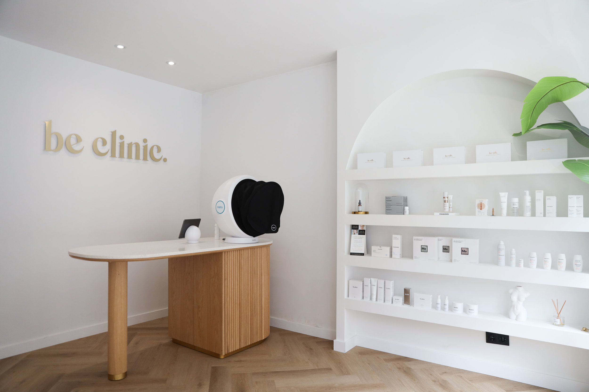
BE CLINIC

INDUSTRY
Commercial, Beauty

PROJECT SCOPE
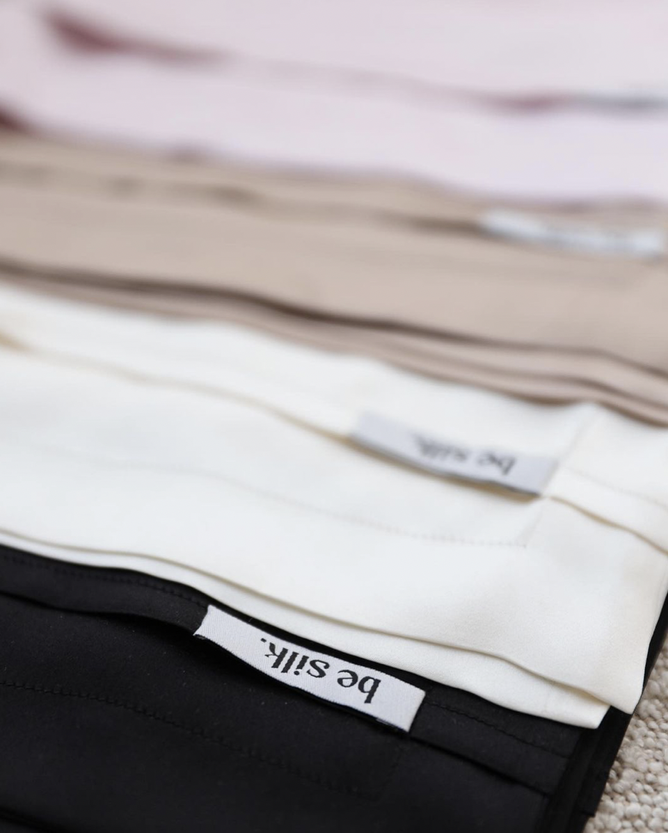
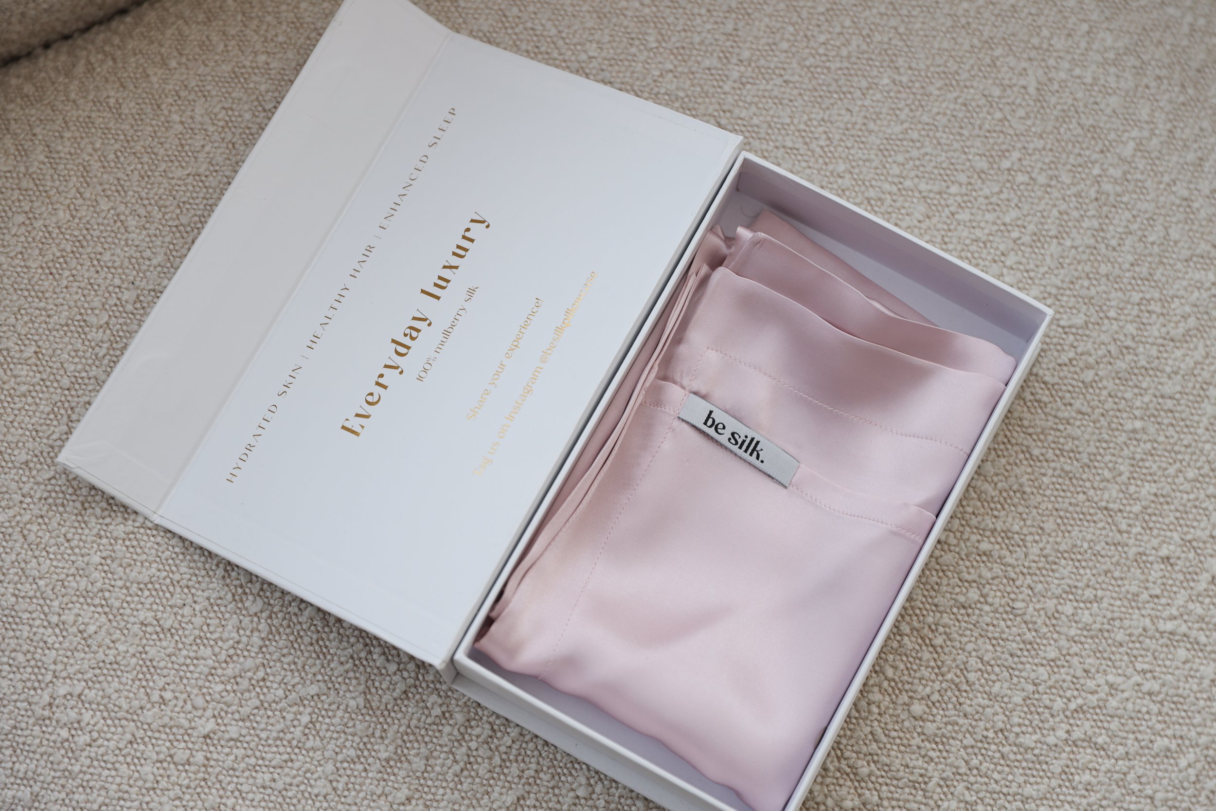
Custom Packaging Design (Product Packaging, Labels, Stickers, swing tags, Craft paper)
Digital Assets Instagram ( highlight icons, feed templates, story templates)
BE CLINIC
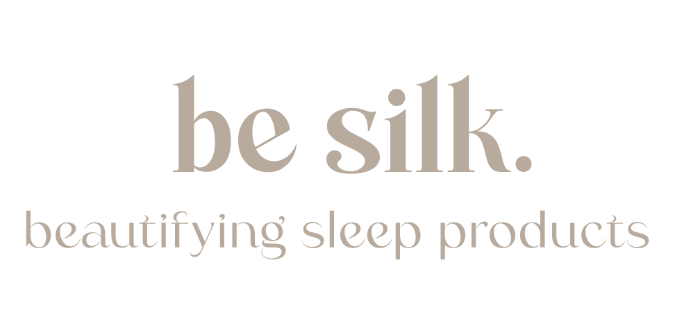
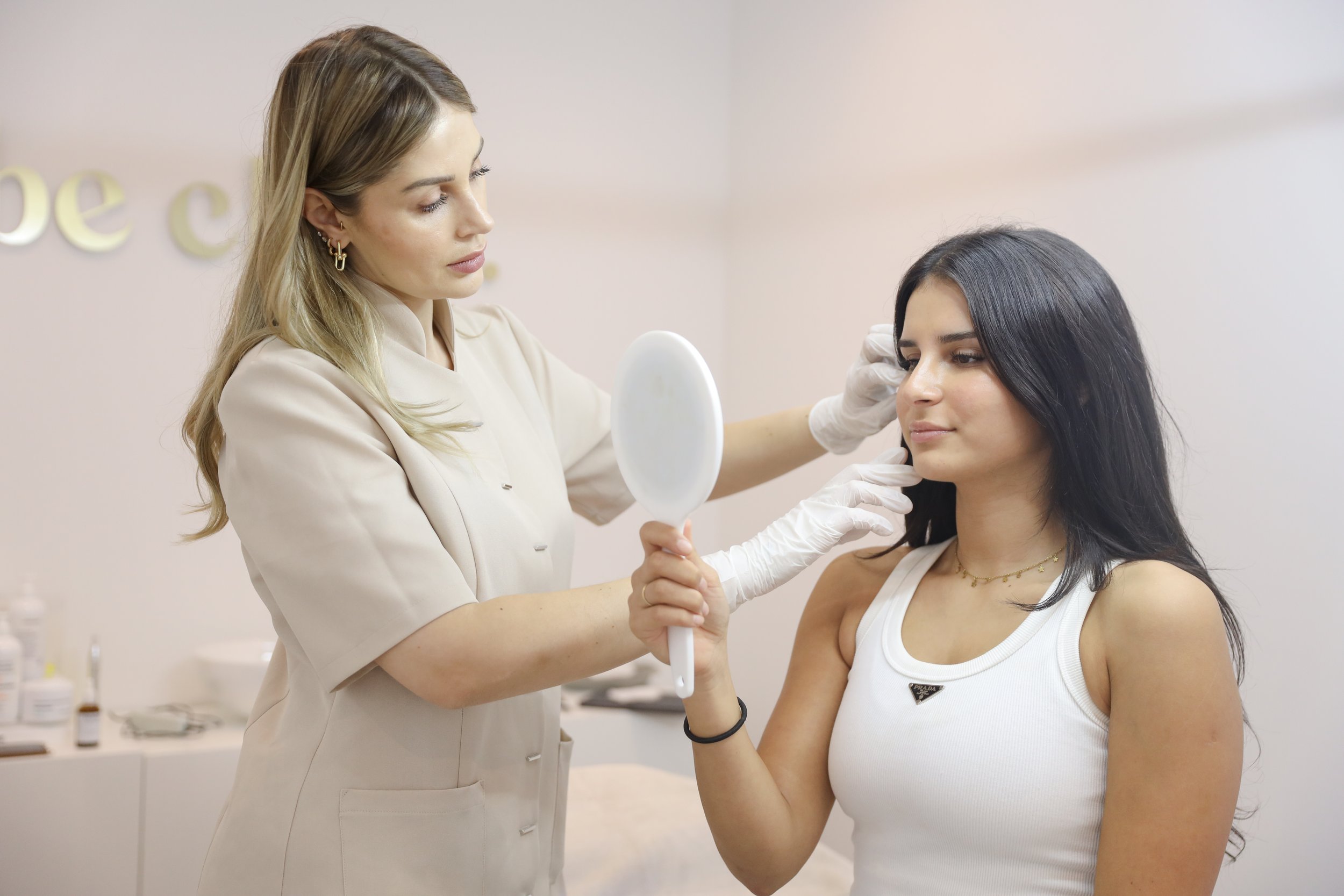
The transformation of this company into a luxurious entity was driven by the role of branding, where the synergy between Be Clinic and Be Silk became prominently evident.
The fusion of these two elements now radiates throughout the company, creating a cohesive and sophisticated image. With the crafted content, the narrative is beautifully brought to life, enhancing the overall look and feel of the brand.
This comprehensive approach enables customers to gain a thorough understanding of the company's offerings, leaving them with a vivid impression of what Be Clinic represents.
Story telling
Video script writing
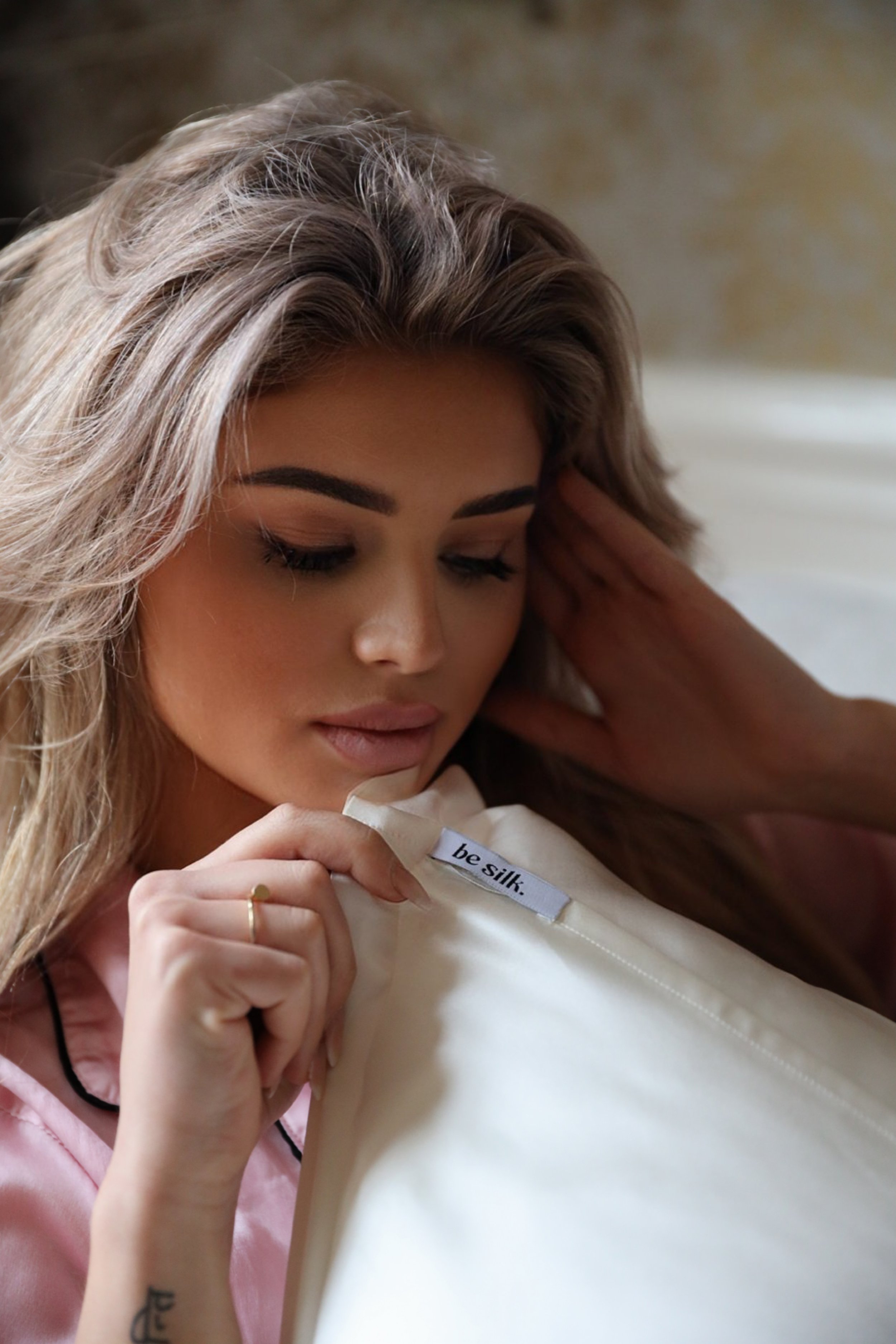
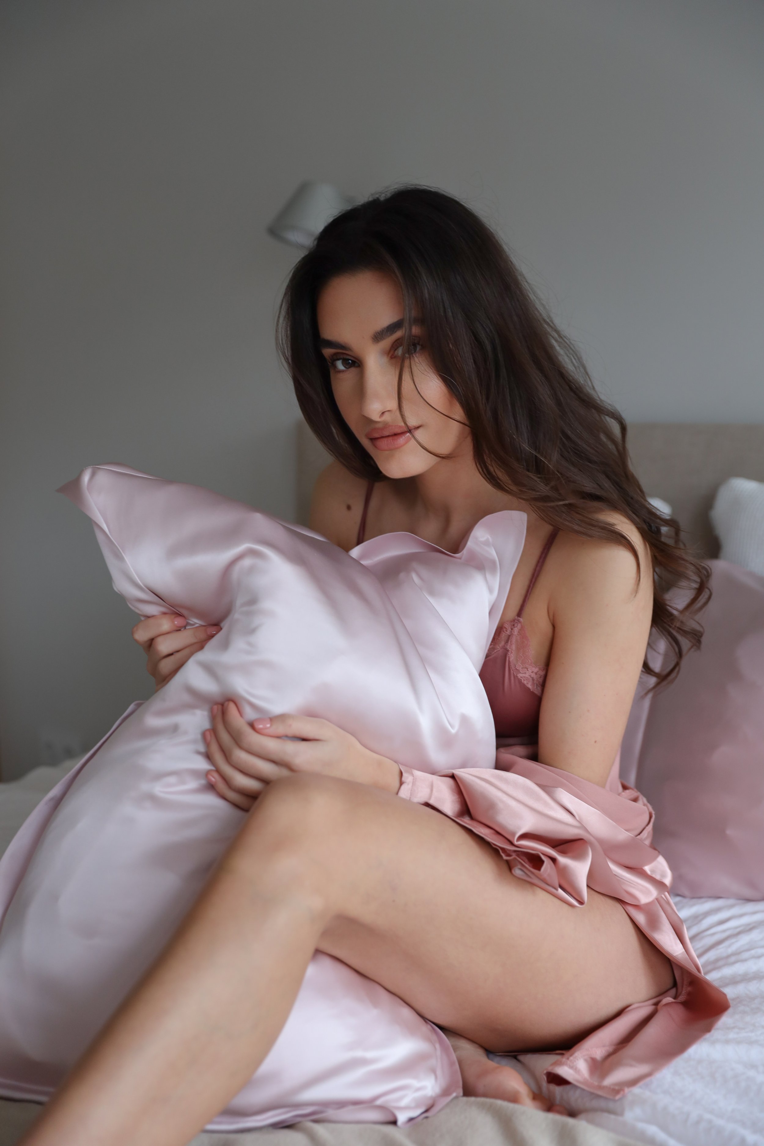
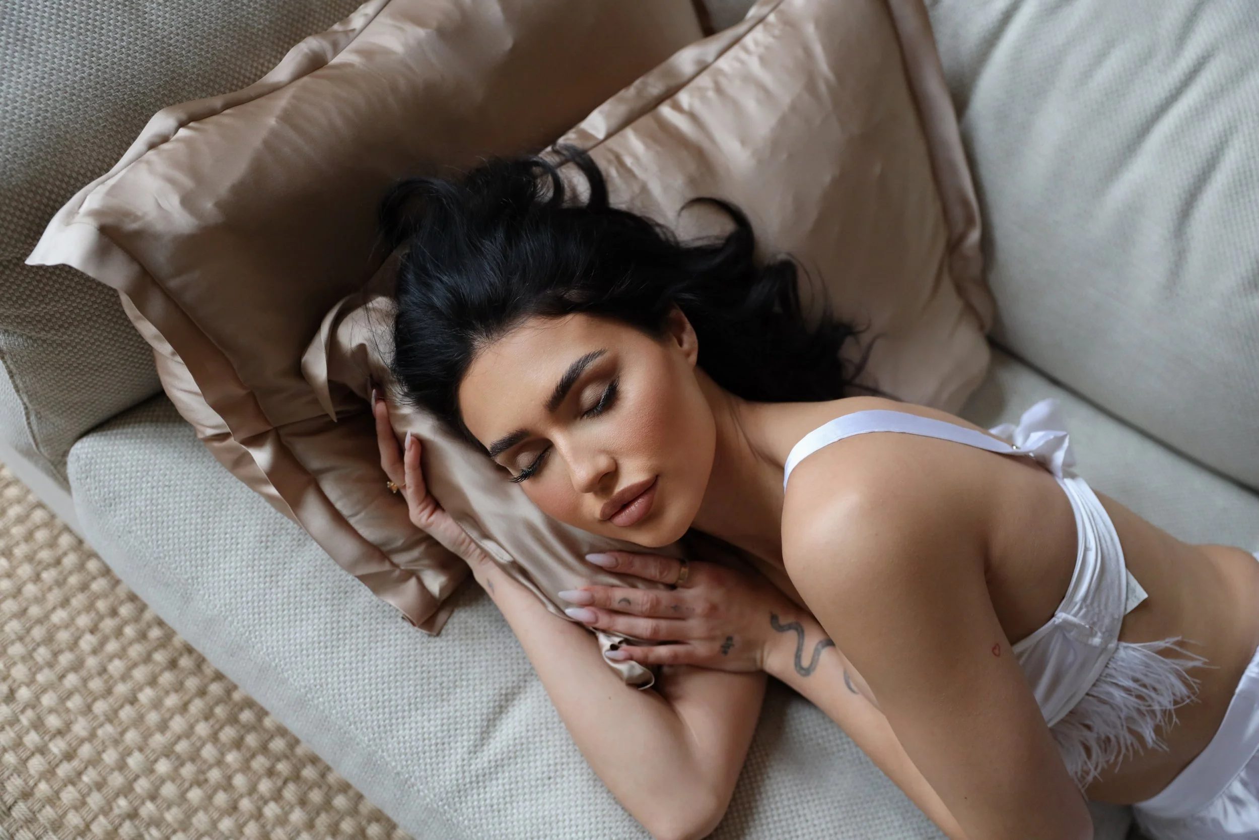
Campaign shoots (Beauty, Commercial)
Campaign video’s
SOCIAL MEDIA
CONTENT
DEEPER MEANING
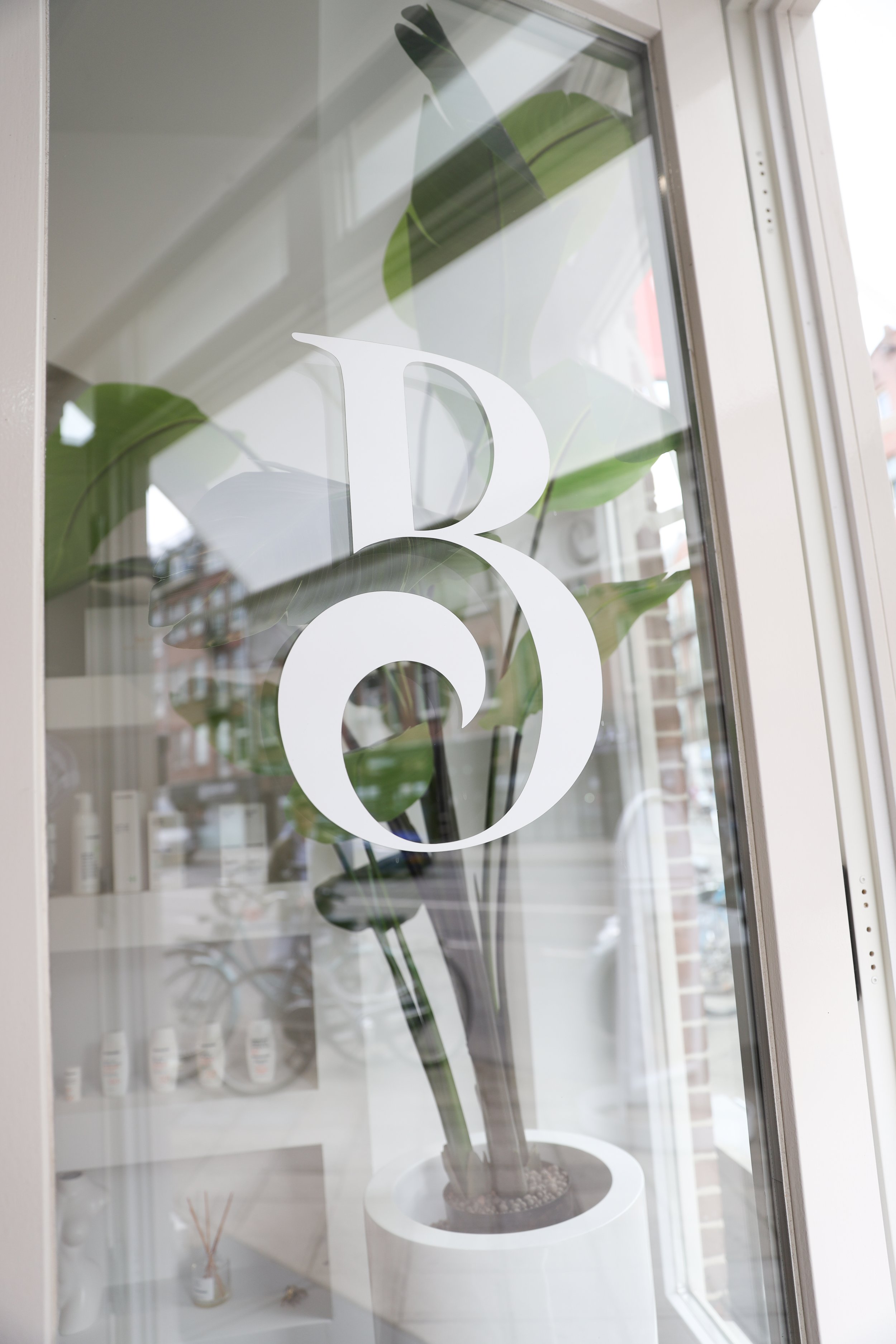
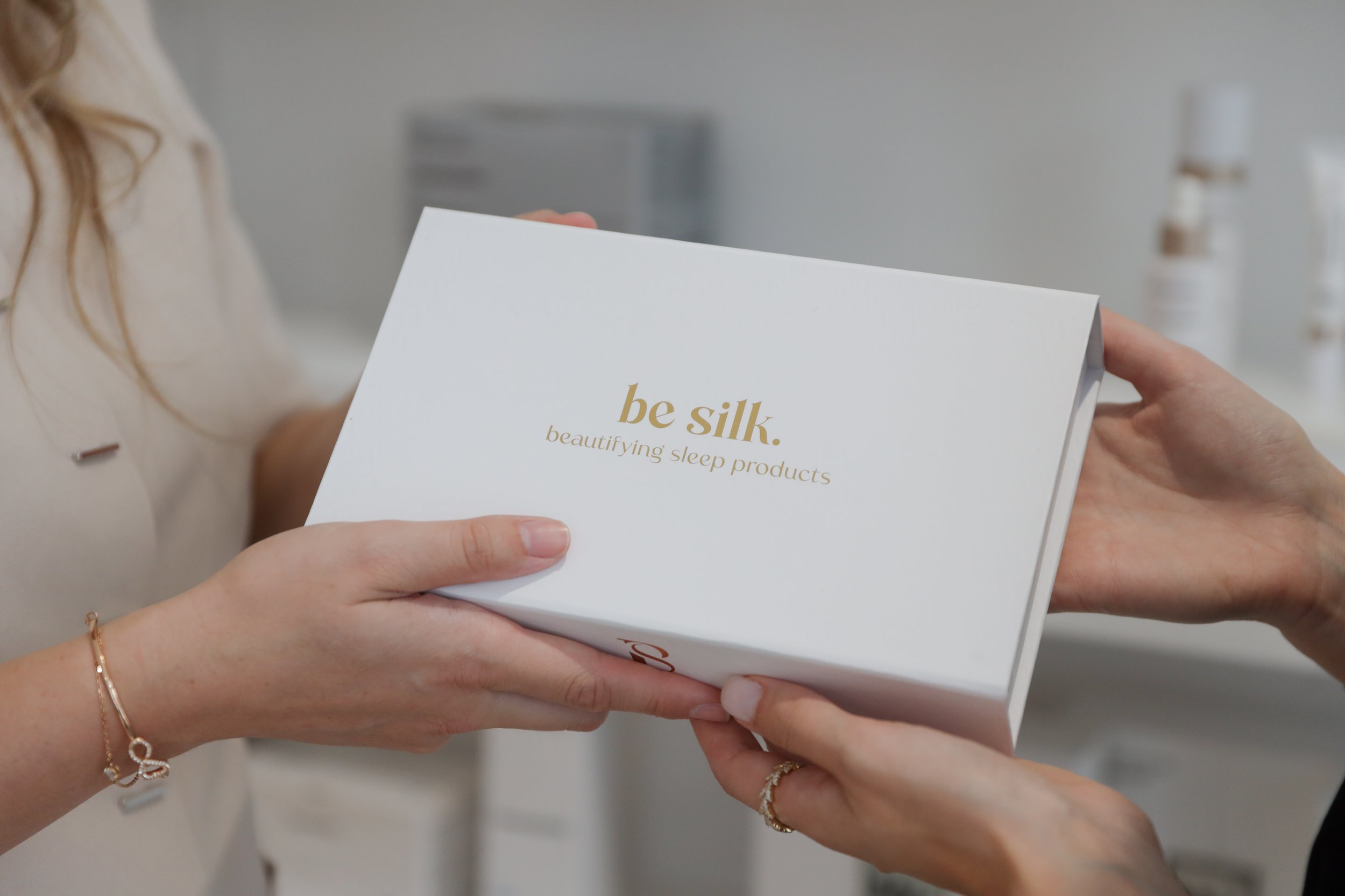
The resemblance between the Be Silk sub logo and the Be Clinic sub logo, as well as the similarity between the Be Silk front logo and the Be Clinic front logo, goes far beyond aesthetics. It's a reflection of a shared design philosophy rooted in a consistent brand identity. These choices were made to convey a deeper meaning: unity and cohesion.